GD Gaio Smooth – Neo-Grotesk
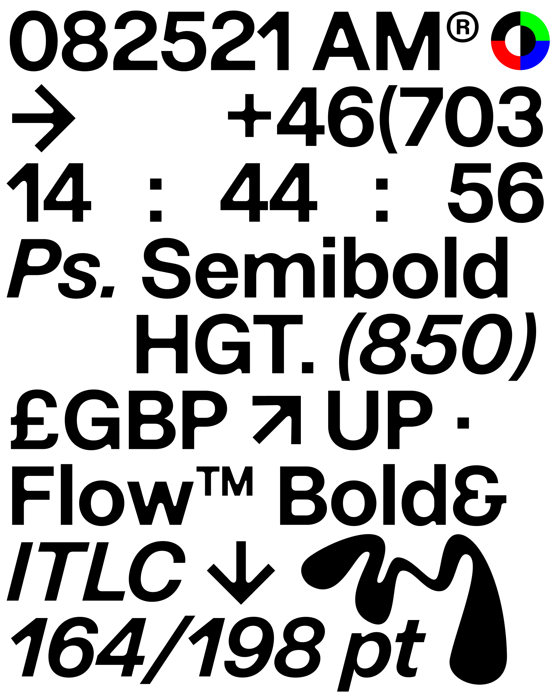
We took our very neutral GD Gaio and made it anything but neutral. By playing with the classic design principle of contrast, sharp edges meet soft, rounded corners to create a typeface with a strong and distinctive character. Applied irregularly and often asymmetrically, these contrasting details create a sense of playful tension, giving the typeface a bold, expressive personality while retaining the underlying clarity of GD Gaio. Nothing is quite where you expect it to be. And that’s the point. GD Gaio Smooth is anything but neutral. It’s expressive, restless and deliberately imperfect, finding character in the space between rules.
Year
2026
Designer(s)
Marcus Gärde,
Jonas Holm
Anders Wikström
Style
Neo-Grotesk
Weights
Regular
Medium
Semibold
Bold
Extra Bold
Black
Regular Italic
Medium Italic
Semibold Italic
Bold Italic
Extra Bold Italic
Black Italic
Features
Open type Alternates
Proportional Numbers
Tabular Numbers
Languages
200+
UPM
2816
Typography guides the reader’s eye, giving words rhythm and clarity. Letterforms carry personality, balancing elegance with function. The choice of typeface can subtly shift tone, while spacing and scale create harmony on the page. Details in curves, serifs, and proportions distinguish one font from another, making text both legible and visually engaging.
Typography guides the reader’s eye, giving words rhythm and clarity. Letterforms carry personality, balancing elegance with function. The choice of typeface can subtly shift tone, while spacing and scale create harmony on the page. Details in curves, serifs, and proportions distinguish one font from another, making text both legible and visually engaging.
Typography guides the reader’s eye, giving words rhythm and clarity. Letterforms carry personality, balancing elegance with function. The choice of typeface can subtly shift tone, while spacing and scale create harmony on the page. Details in curves, serifs, and proportions distinguish one font from another, making text both legible and visually engaging.
Typography guides the reader’s eye, giving words rhythm and clarity. Letterforms carry personality, balancing elegance with function. The choice of typeface can subtly shift tone, while spacing and scale create harmony on the page. Details in curves, serifs, and proportions distinguish one font from another, making text both legible and visually engaging.
Typography guides the reader’s eye, giving words rhythm and clarity. Letterforms carry personality, balancing elegance with function. The choice of typeface can subtly shift tone, while spacing and scale create harmony on the page. Details in curves, serifs, and proportions distinguish one font from another, making text both legible and visually engaging.
Typography guides the reader’s eye, giving words rhythm and clarity. Letterforms carry personality, balancing elegance with function. The choice of typeface can subtly shift tone, while spacing and scale create harmony on the page. Details in curves, serifs, and proportions distinguish one font from another, making text both legible and visually engaging.
Typography guides the reader’s eye, giving words rhythm and clarity. Letterforms carry personality, balancing elegance with function. The choice of typeface can subtly shift tone, while spacing and scale create harmony on the page. Details in curves, serifs, and proportions distinguish one font from another, making text both legible and visually engaging.
Typography guides the reader’s eye, giving words rhythm and clarity. Letterforms carry personality, balancing elegance with function. The choice of typeface can subtly shift tone, while spacing and scale create harmony on the page. Details in curves, serifs, and proportions distinguish one font from another, making text both legible and visually engaging.
Typography guides the reader’s eye, giving words rhythm and clarity. Letterforms carry personality, balancing elegance with function. The choice of typeface can subtly shift tone, while spacing and scale create harmony on the page. Details in curves, serifs, and proportions distinguish one font from another, making text both legible and visually engaging.
Typography guides the reader’s eye, giving words rhythm and clarity. Letterforms carry personality, balancing elegance with function. The choice of typeface can subtly shift tone, while spacing and scale create harmony on the page. Details in curves, serifs, and proportions distinguish one font from another, making text both legible and visually engaging.
Typography guides the reader’s eye, giving words rhythm and clarity. Letterforms carry personality, balancing elegance with function. The choice of typeface can subtly shift tone, while spacing and scale create harmony on the page. Details in curves, serifs, and proportions distinguish one font from another, making text both legible and visually engaging.
Typography guides the reader’s eye, giving words rhythm and clarity. Letterforms carry personality, balancing elegance with function. The choice of typeface can subtly shift tone, while spacing and scale create harmony on the page. Details in curves, serifs, and proportions distinguish one font from another, making text both legible and visually engaging.
Typography guides the reader’s eye, giving words rhythm and clarity. Letterforms carry personality, balancing elegance with function. The choice of typeface can subtly shift tone, while spacing and scale create harmony on the page. Details in curves, serifs, and proportions distinguish one font from another, making text both legible and visually engaging.
Typography guides the reader’s eye, giving words rhythm and clarity. Letterforms carry personality, balancing elegance with function. The choice of typeface can subtly shift tone, while spacing and scale create harmony on the page. Details in curves, serifs, and proportions distinguish one font from another, making text both legible and visually engaging.
Typography guides the reader’s eye, giving words rhythm and clarity. Letterforms carry personality, balancing elegance with function. The choice of typeface can subtly shift tone, while spacing and scale create harmony on the page. Details in curves, serifs, and proportions distinguish one font from another, making text both legible and visually engaging.
Typography guides the reader’s eye, giving words rhythm and clarity. Letterforms carry personality, balancing elegance with function. The choice of typeface can subtly shift tone, while spacing and scale create harmony on the page. Details in curves, serifs, and proportions distinguish one font from another, making text both legible and visually engaging.
All Latin & Cyrillic
A
B
C
D
E
F
G
H
I
J
K
L
M
N
O
P
Q
R
S
T
U
V
W
X
Y
Z
Å
Ä
Ö
a
b
c
d
e
f
g
h
i
j
k
l
m
n
o
p
q
r
s
y
u
v
w
x
y
z
á
â
å
ä
ö
.
,
:
;
…
!
¡
?
#
/
\
-
–
—
_
(
)
{
}
[
]
‚
„
“
”
‘
’
0
1
2
3
4
5
6
7
9
8
&
@
©