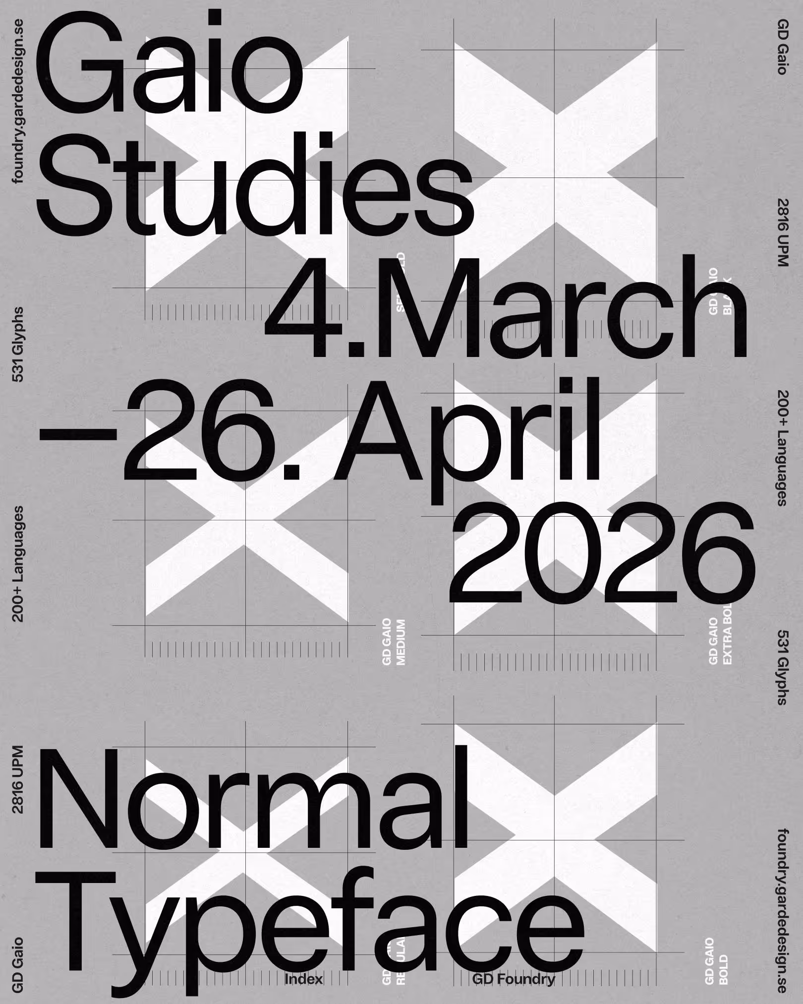
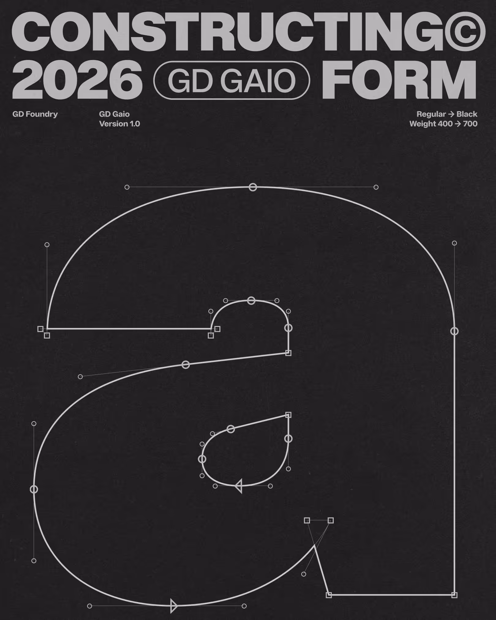
GD Gaio – Neo-Grotesk
What if a typeface could simply disappear? GD Gaio was born from the long tradition of so-called “normal” typefaces — designs that deliberately avoided standing out. From early grotesques in the 19th century to the postwar pursuit of neutrality, designers searched for a letterform that carried no accent, no ego, only clarity. Beatrice Warde once compared good typography to a crystal goblet: it should hold the meaning without drawing attention to itself. In this spirit, Gaio continues the legacy of invisibility. It is not about charm, decoration, or display. It is about neutrality — a silent framework that allows words to pass through unfiltered. Optimized for clarity across screens and sizes, it serves as our house typeface, always present but never obtrusive. And because true communication must reach beyond borders, Gaio was built with support for over 200 languages, covering the Latin alphabet and its extensions. A typeface designed to disappear — so that meaning can appear.
Year
2025
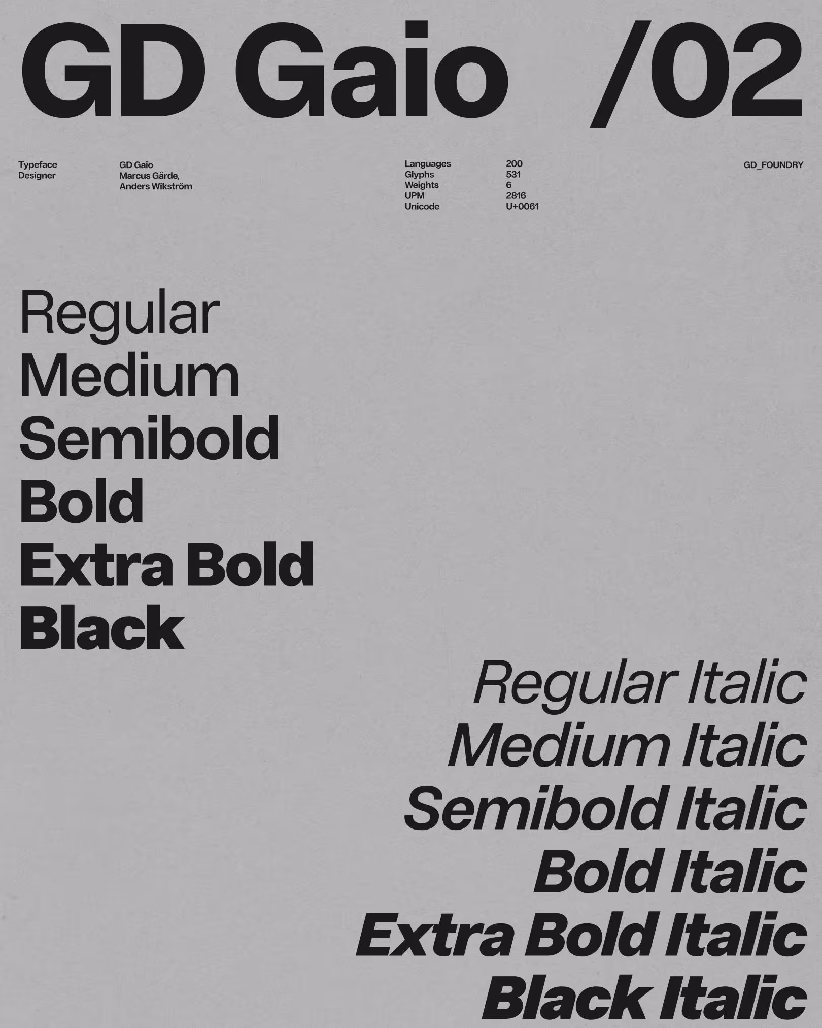
Designer(s)
Marcus Gärde,
Anders Wikström
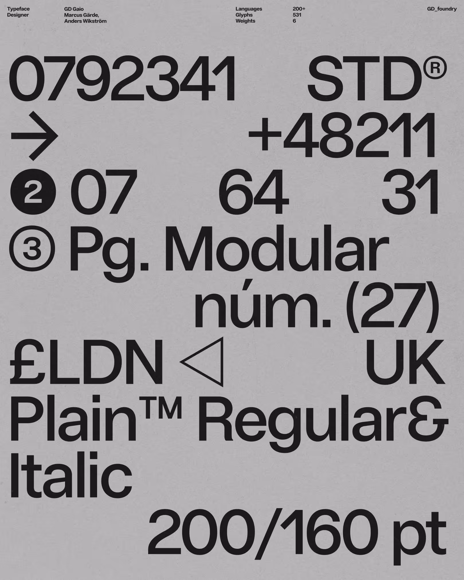
Style
Neo-Grotesk
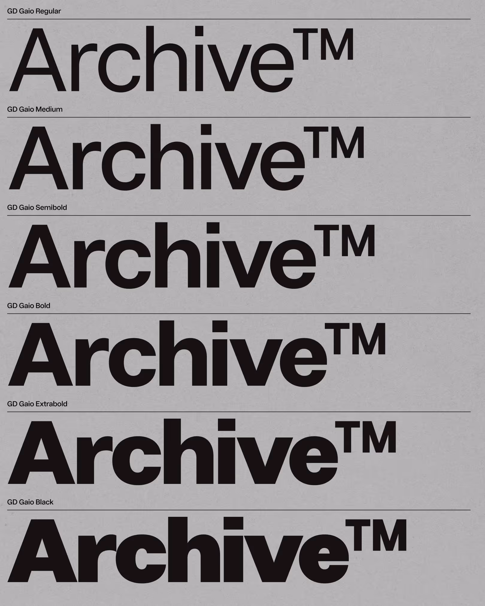
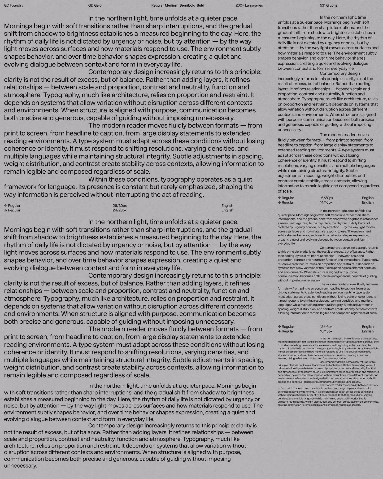
Weights
Regular
Medium
Semibold
Bold
Extra Bold
Black
Regular Italic
Medium Italic
Semibold Italic
Bold Italic
Extra Bold Italic
Black Italic
Features
Open type Alternates
Proportional Numbers
Tabular Numbers
Languages
200+
UPM
2816
Typography guides the reader’s eye, giving words rhythm and clarity. Letterforms carry personality, balancing elegance with function. The choice of typeface can subtly shift tone, while spacing and scale create harmony on the page. Details in curves, serifs, and proportions distinguish one font from another, making text both legible and visually engaging.
Typography guides the reader’s eye, giving words rhythm and clarity. Letterforms carry personality, balancing elegance with function. The choice of typeface can subtly shift tone, while spacing and scale create harmony on the page. Details in curves, serifs, and proportions distinguish one font from another, making text both legible and visually engaging.
Typography guides the reader’s eye, giving words rhythm and clarity. Letterforms carry personality, balancing elegance with function. The choice of typeface can subtly shift tone, while spacing and scale create harmony on the page. Details in curves, serifs, and proportions distinguish one font from another, making text both legible and visually engaging.
Typography guides the reader’s eye, giving words rhythm and clarity. Letterforms carry personality, balancing elegance with function. The choice of typeface can subtly shift tone, while spacing and scale create harmony on the page. Details in curves, serifs, and proportions distinguish one font from another, making text both legible and visually engaging.
Typography guides the reader’s eye, giving words rhythm and clarity. Letterforms carry personality, balancing elegance with function. The choice of typeface can subtly shift tone, while spacing and scale create harmony on the page. Details in curves, serifs, and proportions distinguish one font from another, making text both legible and visually engaging.
Typography guides the reader’s eye, giving words rhythm and clarity. Letterforms carry personality, balancing elegance with function. The choice of typeface can subtly shift tone, while spacing and scale create harmony on the page. Details in curves, serifs, and proportions distinguish one font from another, making text both legible and visually engaging.
Typography guides the reader’s eye, giving words rhythm and clarity. Letterforms carry personality, balancing elegance with function. The choice of typeface can subtly shift tone, while spacing and scale create harmony on the page. Details in curves, serifs, and proportions distinguish one font from another, making text both legible and visually engaging.
Typography guides the reader’s eye, giving words rhythm and clarity. Letterforms carry personality, balancing elegance with function. The choice of typeface can subtly shift tone, while spacing and scale create harmony on the page. Details in curves, serifs, and proportions distinguish one font from another, making text both legible and visually engaging.
Typography guides the reader’s eye, giving words rhythm and clarity. Letterforms carry personality, balancing elegance with function. The choice of typeface can subtly shift tone, while spacing and scale create harmony on the page. Details in curves, serifs, and proportions distinguish one font from another, making text both legible and visually engaging.
Typography guides the reader’s eye, giving words rhythm and clarity. Letterforms carry personality, balancing elegance with function. The choice of typeface can subtly shift tone, while spacing and scale create harmony on the page. Details in curves, serifs, and proportions distinguish one font from another, making text both legible and visually engaging.
Typography guides the reader’s eye, giving words rhythm and clarity. Letterforms carry personality, balancing elegance with function. The choice of typeface can subtly shift tone, while spacing and scale create harmony on the page. Details in curves, serifs, and proportions distinguish one font from another, making text both legible and visually engaging.
Typography guides the reader’s eye, giving words rhythm and clarity. Letterforms carry personality, balancing elegance with function. The choice of typeface can subtly shift tone, while spacing and scale create harmony on the page. Details in curves, serifs, and proportions distinguish one font from another, making text both legible and visually engaging.
Typography guides the reader’s eye, giving words rhythm and clarity. Letterforms carry personality, balancing elegance with function. The choice of typeface can subtly shift tone, while spacing and scale create harmony on the page. Details in curves, serifs, and proportions distinguish one font from another, making text both legible and visually engaging.
Typography guides the reader’s eye, giving words rhythm and clarity. Letterforms carry personality, balancing elegance with function. The choice of typeface can subtly shift tone, while spacing and scale create harmony on the page. Details in curves, serifs, and proportions distinguish one font from another, making text both legible and visually engaging.
Typography guides the reader’s eye, giving words rhythm and clarity. Letterforms carry personality, balancing elegance with function. The choice of typeface can subtly shift tone, while spacing and scale create harmony on the page. Details in curves, serifs, and proportions distinguish one font from another, making text both legible and visually engaging.
Typography guides the reader’s eye, giving words rhythm and clarity. Letterforms carry personality, balancing elegance with function. The choice of typeface can subtly shift tone, while spacing and scale create harmony on the page. Details in curves, serifs, and proportions distinguish one font from another, making text both legible and visually engaging.
All Latin & Cyrillic
A
B
C
D
E
F
G
H
I
J
K
L
M
N
O
P
Q
R
S
T
U
V
W
X
Y
Z
Å
Ä
Ö
a
b
c
d
e
f
g
h
i
j
k
l
m
n
o
p
q
r
s
y
u
v
w
x
y
z
á
â
å
ä
ö
.
,
:
;
…
!
¡
?
#
/
\
-
–
—
_
(
)
{
}
[
]
‚
„
“
”
‘
’
0
1
2
3
4
5
6
7
9
8
&
@
©