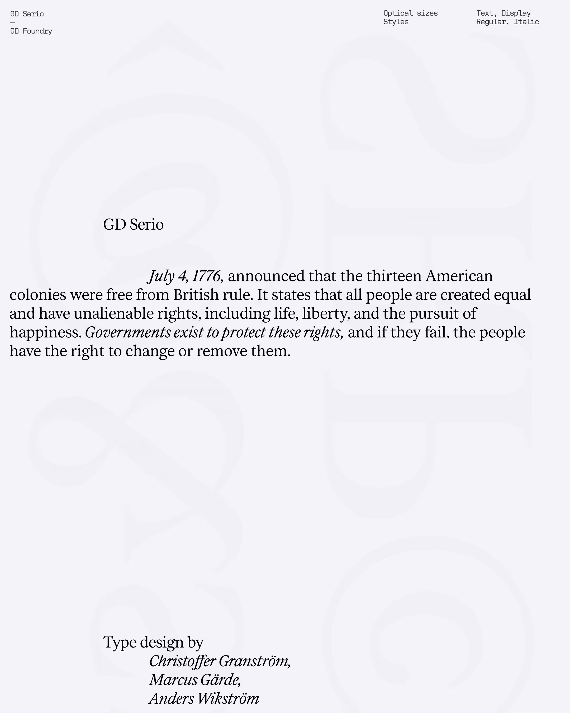
GD Serio — Humanistic Serif
GD Serio, inspired by the humanistic features of 18th-century typefaces such as Baskerville and Caslon. GD Serio features delicate details and an open bowl in the lowercase ‘g’, creating a charming yet crisp appearance. The typeface is complete with small capitals, proportional numbers, and old-style numbers. It is a versatile workhorse for body text and comes in two distinct optical weights: Display and Text, ensuring optimal readability and aesthetic appeal across different applications.
Year
2025
Designer(s)
Christoffer Granström,
Marcus Gärde,
Anders Wikström
Style
Serif
Weights
Text
Display
Italic
Display Italic
Features
Open type Alternates
Proportional Numbers
Tabular Numbers
Languages
200+
UPM
2816


Typography guides the reader’s eye, giving words rhythm and clarity. Letterforms carry personality, balancing elegance with function. The choice of typeface can subtly shift tone, while spacing and scale create harmony on the page. Details in curves, serifs, and proportions distinguish one font from another, making text both legible and visually engaging.
Typography guides the reader’s eye, giving words rhythm and clarity. Letterforms carry personality, balancing elegance with function. The choice of typeface can subtly shift tone, while spacing and scale create harmony on the page. Details in curves, serifs, and proportions distinguish one font from another, making text both legible and visually engaging.
Typography guides the reader’s eye, giving words rhythm and clarity. Letterforms carry personality, balancing elegance with function. The choice of typeface can subtly shift tone, while spacing and scale create harmony on the page. Details in curves, serifs, and proportions distinguish one font from another, making text both legible and visually engaging.
Typography guides the reader’s eye, giving words rhythm and clarity. Letterforms carry personality, balancing elegance with function. The choice of typeface can subtly shift tone, while spacing and scale create harmony on the page. Details in curves, serifs, and proportions distinguish one font from another, making text both legible and visually engaging.
Typography guides the reader’s eye, giving words rhythm and clarity. Letterforms carry personality, balancing elegance with function. The choice of typeface can subtly shift tone, while spacing and scale create harmony on the page. Details in curves, serifs, and proportions distinguish one font from another, making text both legible and visually engaging.
Typography guides the reader’s eye, giving words rhythm and clarity. Letterforms carry personality, balancing elegance with function. The choice of typeface can subtly shift tone, while spacing and scale create harmony on the page. Details in curves, serifs, and proportions distinguish one font from another, making text both legible and visually engaging.
Typography guides the reader’s eye, giving words rhythm and clarity. Letterforms carry personality, balancing elegance with function. The choice of typeface can subtly shift tone, while spacing and scale create harmony on the page. Details in curves, serifs, and proportions distinguish one font from another, making text both legible and visually engaging.
Typography guides the reader’s eye, giving words rhythm and clarity. Letterforms carry personality, balancing elegance with function. The choice of typeface can subtly shift tone, while spacing and scale create harmony on the page. Details in curves, serifs, and proportions distinguish one font from another, making text both legible and visually engaging.
Typography guides the reader’s eye, giving words rhythm and clarity. Letterforms carry personality, balancing elegance with function. The choice of typeface can subtly shift tone, while spacing and scale create harmony on the page. Details in curves, serifs, and proportions distinguish one font from another, making text both legible and visually engaging.
Typography guides the reader’s eye, giving words rhythm and clarity. Letterforms carry personality, balancing elegance with function. The choice of typeface can subtly shift tone, while spacing and scale create harmony on the page. Details in curves, serifs, and proportions distinguish one font from another, making text both legible and visually engaging.
Typography guides the reader’s eye, giving words rhythm and clarity. Letterforms carry personality, balancing elegance with function. The choice of typeface can subtly shift tone, while spacing and scale create harmony on the page. Details in curves, serifs, and proportions distinguish one font from another, making text both legible and visually engaging.
Typography guides the reader’s eye, giving words rhythm and clarity. Letterforms carry personality, balancing elegance with function. The choice of typeface can subtly shift tone, while spacing and scale create harmony on the page. Details in curves, serifs, and proportions distinguish one font from another, making text both legible and visually engaging.


All Latin & Cyrillic
A
B
C
D
E
F
G
H
I
J
K
L
M
N
O
P
Q
R
S
T
U
V
W
X
Y
Z
Å
Ä
Ö
a
b
c
d
e
f
g
h
i
j
k
l
m
n
o
p
q
r
s
y
u
v
w
x
y
z
á
â
å
ä
ö
.
,
:
;
…
!
¡
?
#
/
\
-
–
—
_
(
)
{
}
[
]
‚
„
“
”
‘
’
0
1
2
3
4
5
6
7
9
8
&
@
©