GD Unio – The Contemporary UI-font
GD Unio is a contemporary typeface built on the principle of uniwidth, where each character retains the same horizontal space across all weights and styles. Switch from Regular to Bold, or from Light to Heavy, and the text stays exactly where it is. No reflow, no shifting baselines, no layout surprises. This makes GD Unio exceptionally well-suited for digital interfaces. Buttons hold their size on hover. Hyperlinks don't nudge neighbouring elements when they go active. Labels stay locked in place through every state change. In dynamic UIs where multiple weights coexist or toggle in real time, GD Unio simply holds steady while everything else moves around it. The uniwidth approach is very handy when it comes to buttons, hyperlinks or other UI-elements.
Year
2026
Designer(s)
Marcus Gärde,
Anders Wikström
Style
Uniwidth
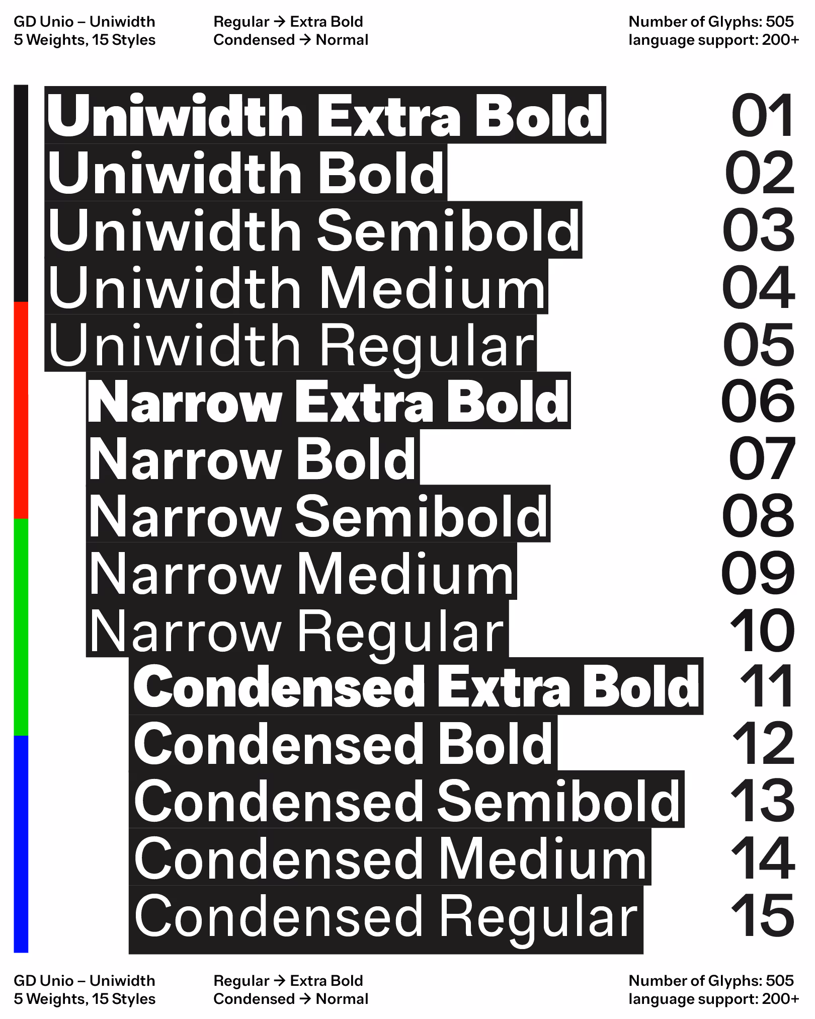
Weights
Regular
Medium
Semibold
Bold
Extra Bold
Condensed Regular
Condensed Medium
Condensed Semibold
Condensed Bold
Condensed Extra Bold
Narrow Regular
Narrow Medium
Narrow Semibold
Narrow Bold
Narrow Extra Bold
Features
Open Type Alternates
Proportional Numbers
Tabular Numbers
Languages
200+
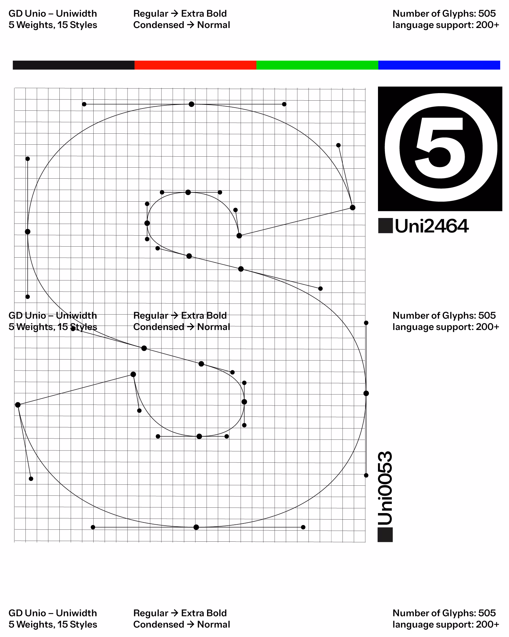
UPM
2816
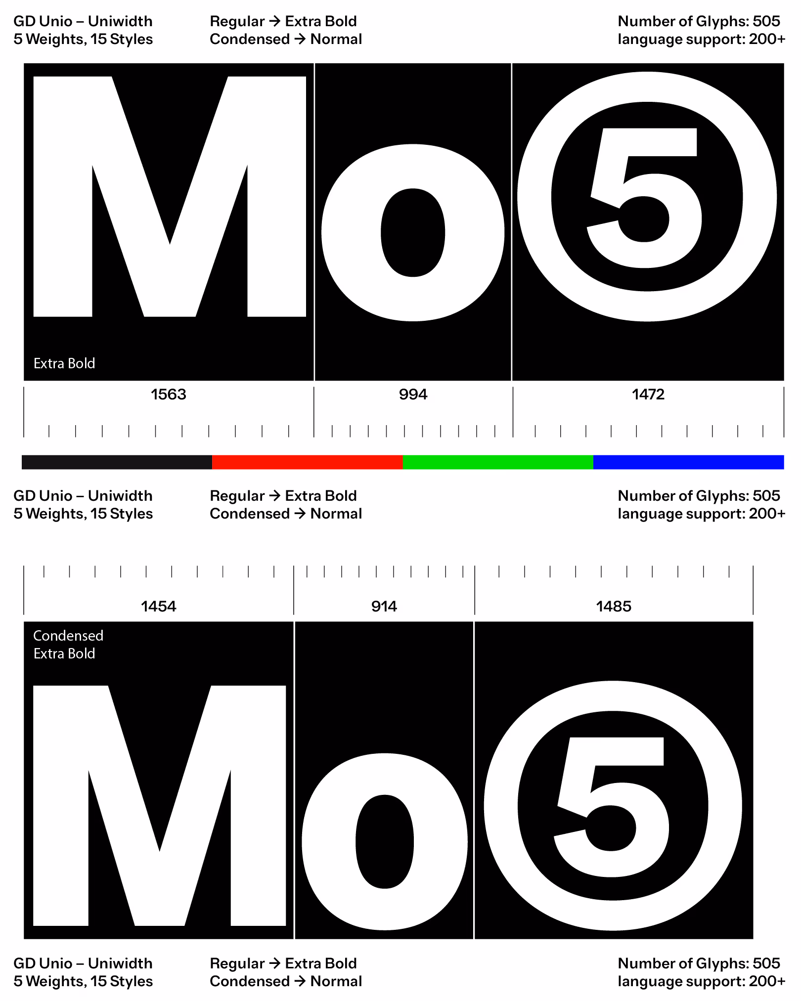
Contemporary typeface built on the principle of uniwidth, where each character retains the same horizontal space across different weights and styles. This design approach ensures that changes in weight, such as switching from Regular to Bold, without affecting text reflow, alignment, or layout. This is very handy when it comes to buttons or hyperlinks
Contemporary typeface built on the principle of uniwidth, where each character retains the same horizontal space across different weights and styles. This design approach ensures that changes in weight, such as switching from Regular to Bold, without affecting text reflow, alignment, or layout. This is very handy when it comes to buttons or hyperlinks
Contemporary typeface built on the principle of uniwidth, where each character retains the same horizontal space across different weights and styles. This design approach ensures that changes in weight, such as switching from Regular to Bold, without affecting text reflow, alignment, or layout. This is very handy when it comes to buttons or hyperlinks
Contemporary typeface built on the principle of uniwidth, where each character retains the same horizontal space across different weights and styles. This design approach ensures that changes in weight, such as switching from Regular to Bold, without affecting text reflow, alignment, or layout. This is very handy when it comes to buttons or hyperlinks
Contemporary typeface built on the principle of uniwidth, where each character retains the same horizontal space across different weights and styles. This design approach ensures that changes in weight, such as switching from Regular to Bold, without affecting text reflow, alignment, or layout. This is very handy when it comes to buttons or hyperlinks
Contemporary typeface built on the principle of uniwidth, where each character retains the same horizontal space across different weights and styles. This design approach ensures that changes in weight, such as switching from Regular to Bold, without affecting text reflow, alignment, or layout. This is very handy when it comes to buttons or hyperlinks
Contemporary typeface built on the principle of uniwidth, where each character retains the same horizontal space across different weights and styles. This design approach ensures that changes in weight, such as switching from Regular to Bold, without affecting text reflow, alignment, or layout. This is very handy when it comes to buttons or hyperlinks
Contemporary typeface built on the principle of uniwidth, where each character retains the same horizontal space across different weights and styles. This design approach ensures that changes in weight, such as switching from Regular to Bold, without affecting text reflow, alignment, or layout. This is very handy when it comes to buttons or hyperlinks
Contemporary typeface built on the principle of uniwidth, where each character retains the same horizontal space across different weights and styles. This design approach ensures that changes in weight, such as switching from Regular to Bold, without affecting text reflow, alignment, or layout. This is very handy when it comes to buttons or hyperlinks
Contemporary typeface built on the principle of uniwidth, where each character retains the same horizontal space across different weights and styles. This design approach ensures that changes in weight, such as switching from Regular to Bold, without affecting text reflow, alignment, or layout. This is very handy when it comes to buttons or hyperlinks
Contemporary typeface built on the principle of uniwidth, where each character retains the same horizontal space across different weights and styles. This design approach ensures that changes in weight, such as switching from Regular to Bold, without affecting text reflow, alignment, or layout. This is very handy when it comes to buttons or hyperlinks
Contemporary typeface built on the principle of uniwidth, where each character retains the same horizontal space across different weights and styles. This design approach ensures that changes in weight, such as switching from Regular to Bold, without affecting text reflow, alignment, or layout. This is very handy when it comes to buttons or hyperlinks

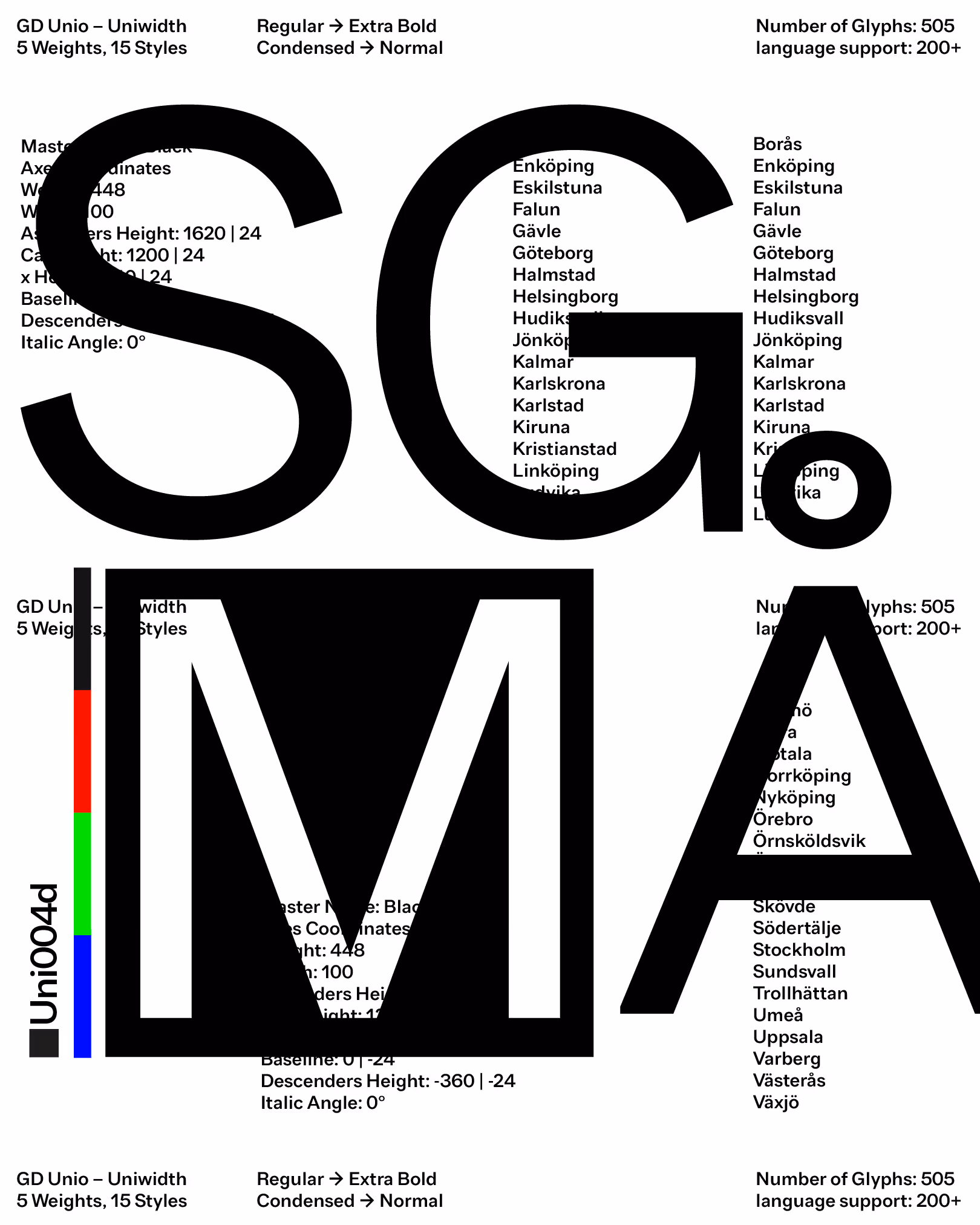
All Latin & Cyrillic
A
B
C
D
E
F
G
H
I
J
K
L
M
N
O
P
Q
R
S
T
U
V
W
X
Y
Z
Å
Ä
Ö
a
b
c
d
e
f
g
h
i
j
k
l
m
n
o
p
q
r
s
y
u
v
w
x
y
z
á
â
å
ä
ö
.
,
:
;
…
!
¡
?
#
/
\
-
–
—
_
(
)
{
}
[
]
‚
„
“
”
‘
’
0
1
2
3
4
5
6
7
9
8
&
@
©